.png)
UI/UX PRODUCT DESIGN
DASHBOARD
AI IVF SOFTWARE
B2C
REDESIGN
B2B
DESIGN SYSTEM
Embryonics
"Embryonics" is an Israeli fertility healthcare startup company that uses artificial intelligence (AI) to increase the success rate of in vitro fertilization (IVF) treatments.
My role in the project
Completed full design cycle including research, design for all states and scenarios, delivery, and development support.
Creating a Design System, maintenance throughout the process, and training for all team members to work with it.
Leading the product design activities in the company and helping with strategic decisions about the company's products.
Collaborating with the developers and providing design solutions to support various resolutions.
Embryonics" products"
The company targets both B2C and B2B markets. As the company's lead product designer, I developed the visual design language and led the design for each product in the company's products.
.png)

Hormonal protocols
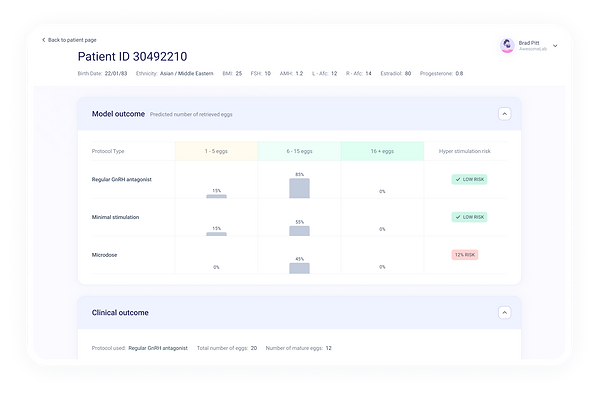
An AI-based B2B tool that helps fertility doctors choose the most effective drug protocol for each patient, thereby maximizing the results of egg retrieval and the chances of achieving a successful pregnancy.

Ubar
(A background on the world of fertility (IVF
The IVF process helps couples with fertility problems achieve pregnancy. In this process, fertility specialist combines the eggs and sperm in the laboratory outside the human body. The embryo is grown and photographed for five to six days. An embryologist then selects the suitable embryo according to the video or photo and transfers it back to the human body to create a pregnancy.
What Ubar does?
Uber is a software based on AI technology that analyses the embryos' media and identifies the chances of success in developing into a normal pregnancy. It optimizes and improves the embryologist's work.
The mission
-
Help more couples realize their dream of starting a family
-
Optimize the process and reduce the costs for the laboratory.
The user
-
Embryologist (an expert, intensive user who specializes in the study of reproduction).
How does UBAR works
A short video shows user selection processes, creating a new patient, adding embryos and more...
Core values
We defined the four core values of the system to guide all the design decisions in this project
01
Unique and modern style
The healthcare industry has its style, and everything looks almost the same. We wanted our style to stand out. Because the technology of "Uber" is innovative, it is essential that the design also looks modern, thus conveying the innovation in technology and design. In addition, it makes it easier for an embryologist with multiple systems on his screen to locate "Uber" quickly and enjoy it aesthetically.
02
Softness
Implemented through:
-
Smears of color spots give uniqueness, interest, and colorful elements in the background.
-
Rounded corners in tabs and menu.
-
Rounded buttons.
-
Subtle shadow.
Everything in the right dose of colors and elements.
03
Illustrative design and use of icons
An illustration supports the content and creates an easy atmosphere, giving a more inviting feeling to interact with the system. Users scan faster the information accompanied with icons and appropriately distributed.
04
Clean and minimalist design
Users work with the system for many hours daily and must process a lot of information and data. A minimalist design helps to focus, and lots of white space makes for a clean and straightforward interface that is easy to scan.
Brand language
I was responsible for branding and the visual design language of the product. I used illustrations of people to give the user a sense of personalization, which helped to create a uniform, easy, pleasant and personal language.
Avatars
Icons
Illustrations
Challenge #1
Bad call to action design
In the old system, many places needed a clear call to action. Upon entering the system, a user immediately lands on a table page with a lot of information.
Here is a login screen from the old system. We see a patient page with a lot of information, lists, and tables, and it needs to be clarified what the user should do with this information. In addition, the side menu that was not fixed and changed with each action required to be more explicit.

Solution - homepage
The first change we made was adding the home page. You no longer land straight on a table upon login. The home page now hosts the most common actions in a centralized manner. From here, the user can add a new patient. This action hierarchy is also more prominent in the tab size and accompanied by an illustration. In addition, you see reviews, reminders, and alerts. You could use this real estate to organize and manage additional notifications.
Following the design values we defined earlier, you can see how they manifested on this screen: adding smears of color spots that give uniqueness, colorful elements in the background. Round corners in tabs and menu, rounded buttons, use of subtle shadow. And also the use of illustrative design. And as a result, we were able to make an interface that encourages actions and is easy to navigate.
Two color palettes tested
01
Purple color palette
More feminine, soft colors, less resembling the medical and technological world, but can help stand out from the competition.
.png)
02
Green-blue color palette
This color palette helps the user focus their attention and make the messages accessible. In addition, using the dominant colors, such as dark blue in the side menu, makes a proper separation between the contents and actions in the center of the page and between the side menu. These colors convey more calmness, confidence and, in the proper doses, produce a clean and minimalistic screen.
.png)
Final version
Here is another example from an old system - the embryo page.
You can see how components on this screen need to create clear calls to action.
Setting a probability grade is critical and has to look more clickable.
Not clear if the video player supports a full-screen mode.
Not clear that highlights refer to the video above.
Hierarchically, the timeline is much more critical than highlights but occupies less space and has no focus.

An "all embryos overview" horizontal tabbed navigation menu component. You can see all embryos' statuses simultaneously and select the individual item to get more details.
All grades can be seen at once to encourage the user to rate. When choosing a grade, there is a flow of several related questions.
System generated grade - "Ubar" prediction. Below you can see the negative score look and feel:
I placed highlights immediately below the video because they are important stages in the development of the fetus. You skip directly to a point in the video seek bar by clicking a thumbnail giving the embryologist a glimpse of what is going on with that embryo.
Video analysis according to the times of the embryo's division, with the option to add and change. In addition, there is a marking below for the optimal times.
Instead of a boring form that an embryologist had to fill out after entering a score, we proposed a component where we generate a question and a friendly illustration randomly.

Challenge #2
User flows that are fun and friction-free
In the old system, the controls were misleading and unclear in terms of operation and the user's understanding. Our goal was to optimize the processes.
Date Picker
Previously, this was a very clunky dropdown with many choices and individual scrolling. We created a more straightforward widget with the possibility of continuous typing.

Before

After
Multiple choices
In creating a new patient, a user must make a diagnosis selection, which can be several selections. The previous menu design had a dropdown that would close upon each selection without indicating that it supports multiple choices.

Before

After
Upload multiple media
In the old system, uploading only one file was possible. It would have resulted in much work for the embryologist. We provided a solution that allows you to add multiple media files and analyzes them by the system on the go.

Already in a file upload pop-up dialog, you can associate the media of embryos with wells and save precious time for the embryologist.
During the upload and analysis by the system, a user sees the progress bar of each stage and can perform other actions in parallel.
When loading files of several patients, this component becomes a drawer and shows information per each file and in total.
The embryologist can collapse/expand the pop-up window so that it will not interfere with other work.
Uploading files of several patients - expanded view.
After uploading and analyzing the files, the system displays the summary, including the status of each embryo: successful, disqualified or technical problem. If all the embryos were successful, you get a "Wow, how amazing, all passes are successful" screen. If there is a technical problem, the user will see a message to check the internet connection or file format and try again.
The shift from individual to teamwork
Challenge #3
In the first version of the system, each embryologist had a user. The goal was to allow exclusive access to his patients' data, reduce the information load on each embryologist, and track the decision-making.
Later, the field tests discovered that embryologists from the same lab tend to work in groups and under the same user.
Solutions
Allow teamwork as a lab, where the entire team has access to all information while preserving the sense of responsibility and the ability to investigate decisions. We solved this challenge by creating a personal profile for each embryologist with one password for the entire laboratory.

After logging into the system, you see the screen with all the user profiles in the laboratory

To make a change, add or delete a profile, users can click the manage profile button

To change an avatar, users click on the image to select the desired picture from the stock.
We mapped all possible states of profiles
Duplicate name error
Marking the profile for deletion with an option to undo


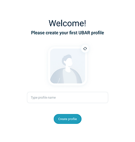
Creating the first profile for the user
Creating Design System
Developing a smart Design System that will help launch features and new products efficiently and quickly. It will allow focusing on the layout and the functionality while reusing the elements already designed.
What did I learn from building a Design System from scratch?
When I started working on this project, I decided to focus on enabling faster and more uniform designs to further reduce design and development costs. A few weeks after we laid out the foundation of the design system, more team members joined the work. That was the real test, and we passed it because new team members could get up to speed and provide deliverables on time by using the design system's libraries, icons, principles,
guidelines and other components.